 Dropbox Image
Source
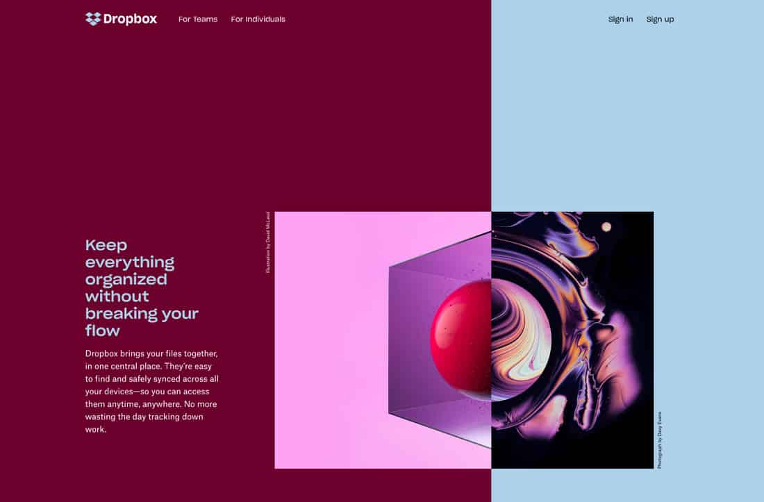
Dropbox has another one of those color schemes that shouldn’t work … but it does. The contrast between the deep maroon and baby blue establishes great eye movement across the split-screen. The colors work equally well as text elements on the opposite color. Once more, it proves that sometimes you just have to try color options out and see how they work.
Download the Dropbox color scheme palette image with the color hex codes as a single image. These are the suggested colors to be used for digital media.