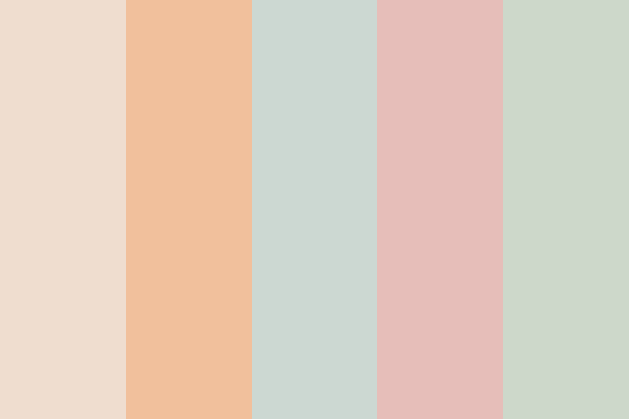
 Pastel Aesthetic Image
The Pastel Aesthetic palette is consists of 5 colors, the colors are Goldenrod Yellow, Pale Turquoise, Classic Rose, Silver Lake Blue, Cornflower Blue, The color codes: RGB, CYMK for print, and Hex for web HTML/CSS.
Download the Pastel Aesthetic color scheme palette image with the color hex codes as a single image. These are the suggested colors to be used for digital media.
In the realm of design, pastel aesthetic color schemes have emerged as a captivating trend, captivating audiences with their soft hues, delicate blends, and a touch of whimsical charm. Pastel colors, characterized by their muted tones and desaturated vibrancy, evoke a sense of serenity, harmony, and timeless elegance, making them a versatile choice for a wide range of design applications.
Pastel aesthetic color schemes are often associated with a sense of tranquility, nostalgia, and a touch of whimsy. The soft, muted tones create a calming ambiance, reminiscent of gentle breezes, blooming flowers, and the delicate shades of watercolor paintings. This serene atmosphere appeals to a broad audience, fostering a sense of peace and relaxation.
Pastel aesthetic color schemes extend beyond the realm of tranquility, embracing a touch of whimsy and playful charm. The delicate blends of pastel hues lend themselves to a variety of design styles, from the soft minimalism of Scandinavian design to the whimsical charm of vintage illustrations. This versatility allows pastel aesthetic color schemes to adapt to a wide range of design applications, from fashion and home décor to web design and branding.
Pastel colors possess a unique ability to evoke a range of emotions, influencing the overall perception of a design. Soft pastel hues like lavender and baby blue instill a sense of serenity and tranquility, while bolder pastel shades like mint green and peach evoke feelings of optimism and cheerfulness. These emotional associations make pastel aesthetic color schemes an effective tool for creating specific moods and atmospheres in design.
Pastel aesthetic color schemes can be employed strategically to create cohesive and engaging visual experiences. A well-balanced pastel palette can establish a harmonious color story, while carefully selected accents can add visual interest and depth. Designers can also utilize pastel colors to create a sense of contrast, pairing muted pastels with bolder hues to create a dynamic and eye-catching design.
When incorporating pastel aesthetic color schemes into design, consider the following guidelines:
Palette Selection: Choose a harmonious palette of pastel hues that align with the desired mood and atmosphere.
Balance and Contrast: Balance muted pastel tones with carefully selected accents to create visual interest and depth.
Variety of Tints and Shades: Utilize a variety of tints and shades within the pastel palette to add dimension and texture.
Consider the Context: Adapt the pastel palette to the specific context of the design, ensuring it complements the overall style and purpose.
By following these guidelines, designers can effectively employ pastel aesthetic color schemes to craft tranquil, inviting, and visually appealing designs.
Pastel aesthetic color schemes have captivated the world of design, offering a refreshing and versatile approach to creating serene, whimsical, and timeless designs. The soft hues, delicate blends, and emotional resonance of pastel colors make them a powerful tool for designers seeking to evoke a sense of tranquility, harmony, and a touch of playful charm. As the allure of pastel aesthetic color schemes continues to grow, their impact on design is sure to endure, inspiring designers to create captivating visuals that resonate with audiences worldwide.