
SeekColor is essential when planning a successful photo shoot with a cohesive color theme. Color plays a vital role in shaping the mood, energy, and storytelling in photography. Whether you’re preparing for a fashion shoot, a family portrait, or a product photo session, selecting a well-coordinated color palette can help create stunning, professional images that resonate with your audience. In this guide, we will walk you through the importance of color in photography and provide you with practical tips to help you plan a photo shoot with a unified and visually appealing color scheme. Learn more about the importance of color in photography.
Why Color Matters in Photography
Color is one of the most powerful elements in photography. It influences how viewers perceive and emotionally connect with the image. The use of color helps convey the intended message, mood, and tone of the photo. When planning a shoot with a cohesive color theme, it’s important to understand how different colors can affect the overall aesthetic. Explore how colors influence emotion in photography.
For example, colors like blue and green often evoke feelings of tranquility and calmness, making them perfect for serene portraits or nature-based shoots. On the other hand, vibrant colors like red and yellow create a sense of energy and excitement, making them ideal for fashion or event photography.
When colors are used thoughtfully, they can also guide the viewer’s attention to specific elements of the image, creating a more focused and professional composition. Using SeekColor as a guide can help you navigate these choices and find a palette that works well for your vision. Discover the psychological effects of colors in photography.
Tip: Use complementary colors (colors opposite on the color wheel) to create dynamic contrast or analogous colors (next to each other on the wheel) for a harmonious effect.
How to Choose a Cohesive Color Palette
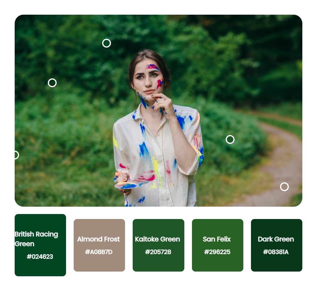
Choosing the right color palette is essential for a photo shoot that feels unified and visually cohesive. Here are some tips to help you select the perfect palette for your next shoot:
-
Start with a Theme or Mood: Before selecting colors, think about the emotional tone you want your photos to convey. A wedding shoot may benefit from soft pastels, while an urban fashion shoot might call for bold, contrasting colors. Read more on choosing a color palette for weddings.
-
Consider the Environment: The location of your shoot plays a huge role in the color selection. If you’re shooting outdoors, consider how the natural surroundings will complement or contrast with your chosen palette. For example, a beach setting works well with soft, muted tones, while a cityscape can support bold and vibrant colors. Check out color schemes for outdoor shoots.
-
Limit the Number of Colors: A simple rule for creating a cohesive palette is to use no more than three to five colors. Too many colors can make the photo appear chaotic. Instead, stick to a base color and select complementary hues for accents. Learn how to limit your palette for professional photos.
-
Use Neutrals to Balance: Neutrals like white, gray, black, and beige can help ground the color scheme, providing balance and ensuring that the photo isn’t overwhelmed by bright or bold colors. Explore the use of neutrals in design.
-
Consider the Season: The time of year can influence your color palette. Light, airy colors like pastel pinks and blues are ideal for spring, while deeper tones like maroon and forest green work well for fall or winter. Discover seasonal color schemes for photo shoots.
SeekColor is an excellent tool to help you visualize how different colors work together before you commit to a final palette. Try online color palettes with SeekColor.
Coordinating Colors with Subjects and Clothing
When you’re working with multiple subjects or models, coordinating their outfits with your chosen color palette is essential to ensure visual harmony. Here are a few tips on how to make sure everyone’s clothing works well together:
-
Match Clothing to the Color Palette: Choose clothing that aligns with your selected color scheme. Stick to solid-colored outfits that won’t distract from the overall theme. Check out expert tips for wardrobe coordination.
-
Use Color Blocking: Color blocking is a technique where contrasting blocks of color are used in the clothing or accessories of your models. This can add visual interest and help highlight specific areas of the photo. Learn how to use color blocking in photography.
-
Pay Attention to Skin Tones: Different colors can flatter various skin tones in unique ways. Be sure to choose colors that complement your subjects’ natural coloring, ensuring they look their best in every shot. Read more on how color affects skin tone in photography.
-
Accessorize with Care: Accessories like scarves, jewelry, and hats can reinforce the color palette but should not overpower the main colors. Stick to neutral or subtle-colored accessories that won’t compete with the clothing. Find out how accessories can enhance your color scheme.
Enhancing the Color Theme with Props and Location
The setting and props can also help elevate your color theme. Here’s how to ensure your location and props support the cohesive look you’re aiming for:
-
Location: Whether you’re shooting in a studio or on location, make sure the environment complements your color palette. For example, a shoot in a rustic barn could be enhanced by earth tones, while a modern studio could benefit from sleek, monochromatic shades. Learn how location can enhance your color scheme.
-
Props: Props like furniture, flowers, or even lighting can add an extra layer of color and texture to the shot. Be sure that your props don’t overwhelm the subject but instead support the color scheme. For instance, a colorful bouquet can provide a pop of color that complements the rest of the shoot’s palette. Read about using props effectively in photos.