
SeekColor is your go-to tool for transforming how you approach color in your design projects. From graphic designers to marketing professionals, using SeekColor right from the start enables you to craft visually stunning and brand-consistent materials. In today’s competitive market, understanding color psychology and mastering the art of palette creation are crucial to capturing attention and influencing customer behavior. SeekColor provides intuitive tools and expert insights that help you generate unique color combinations, test readability, and apply harmonious palettes across various media. In this comprehensive guide, we’ll explore why SeekColor is essential for creative professionals, how to leverage its features effectively, and best practices for integrating it into your design process—all aimed at elevating your overall brand impact.
Why SeekColor is Essential for Designers
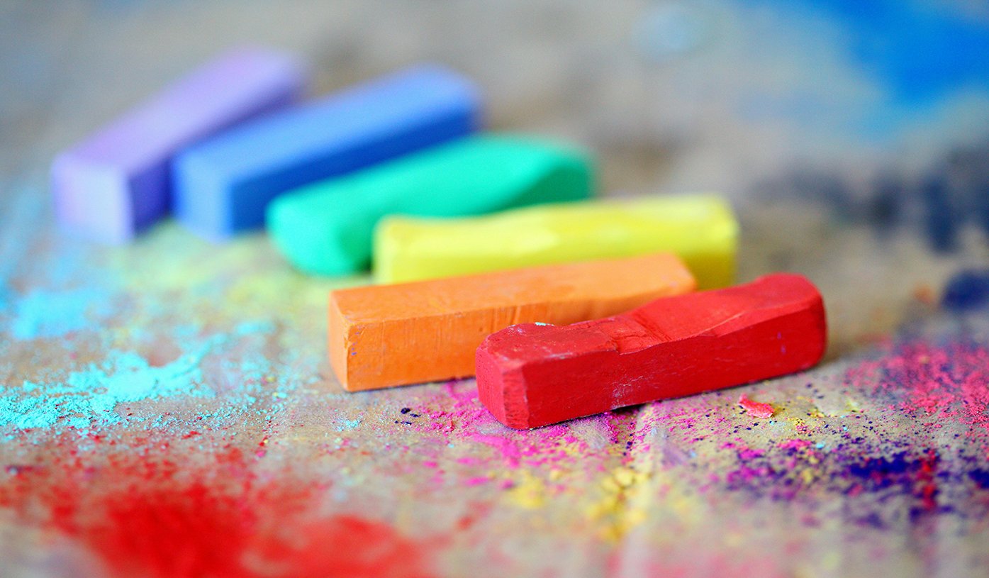
The Impact of Color Psychology
Colors are powerful; they evoke emotions, influence decisions, and shape brand perceptions. SeekColor assists designers in understanding these nuances by offering data-driven insights into color psychology. For example:
- Red: Evokes passion and urgency, perfect for call-to-action elements and promotional materials.
- Blue: Instills a sense of trust and professionalism, ideal for corporate branding and financial services.
- Green: Symbolizes growth and balance, widely used in eco-friendly and health-related projects.
By leveraging SeekColor, you can ensure your chosen palette not only appeals aesthetically but also resonates with your audience’s emotions. To delve deeper into the psychology behind these color choices, visit Color Matters.
Enhancing Brand Identity
A consistent and well-crafted color palette is a cornerstone of strong brand identity. Research shows that brands using consistent color schemes can boost recognition by up to 80% (Forbes). SeekColor offers a range of pre-made palettes and customization options to help you maintain this consistency across all digital and print channels. With its user-friendly interface, even those with limited design experience can create professional, branded visuals.
How to Use SeekColor for Stunning Designs
1. Create Custom Color Palettes
SeekColor empowers users to generate custom palettes that perfectly match their project requirements. Key features include:
- Image-based Palette Generation: Upload an inspiration image and let SeekColor extract the dominant colors.
- Trending Palettes: Browse through popular and seasonal color schemes that are proven to engage audiences.
- Customization Tools: Adjust hue, saturation, and brightness to fine-tune your color choices.
For additional advanced palette creation tools, you might consider exploring Adobe Color or Coolors.
2. Test for Accessibility and Readability
Color contrast and accessibility are paramount in today’s design standards. SeekColor integrates contrast-checking features that ensure your color combinations meet accessibility guidelines, such as the Web Content Accessibility Guidelines (WCAG). This helps prevent design elements from being too similar in tone, which can reduce readability. To further test your design’s compliance, you can useWebAIM: Contrast Checker.
3. Apply SeekColor in Web and Graphic Design
Using SeekColor is not limited to generating appealing color palettes—it also integrates seamlessly into your design workflow. Whether you’re working on websites, social media graphics, or printed materials, SeekColor ensures your designs are consistently engaging and visually coherent. Key application areas include:
- Digital Interfaces: Improve user experience by selecting high-contrast color schemes that enhance readability on screens.
- Marketing Materials: Create vibrant and consistent flyers, brochures, and banners that capture your brand’s essence.
- Social Media Content: Design posts that stand out and drive engagement through carefully chosen color combinations.
For professional design inspiration and further insights, explore creative communities like Behance and Dribbble.
Advanced Techniques and Best Practices
Integrating SeekColor into Your Workflow
To fully benefit from SeekColor, consider these best practices:
- Consistency is Key: Use a unified color palette across all your branding and marketing platforms to build a memorable identity.
- Experiment Regularly: Don’t be afraid to try out new color combinations. Seasonal campaigns or special promotions can benefit from a refreshed palette.
- Keep Accessibility in Mind: Regularly check your designs against accessibility standards to ensure that every user can enjoy your content.
Utilizing Data and Analytics
SeekColor is not just about aesthetics; it can also be a valuable tool in data-driven design. Use analytics to understand which color combinations perform best with your target audience. Tracking engagement metrics and conversion rates can provide insights into how color impacts user behavior, helping you refine your approach over time.
Learning from Industry Leaders
Stay updated with industry trends and expert opinions. For instance, Smashing Magazine offers in-depth analysis on color theory and its application in modern web design. These resources can provide additional context and innovative ideas to further enhance your designs using SeekColor.