
SeekColor is an essential tool for designers, developers, and creatives who need to extract colors from images accurately. Whether you’re working on branding, UI/UX design, or digital artwork, obtaining precise color codes ensures consistency across all platforms. With SeekColor’s Color Picker, you can quickly get HEX, RGB, CMYK, and other color values from any image without the need for expensive software.
Understanding how to extract colors efficiently can enhance your design workflow, helping you maintain brand identity and aesthetic coherence. In this guide, we will walk you through the steps to use SeekColor’s Color Picker, explore its features, and highlight why it’s an essential tool for designers and developers.
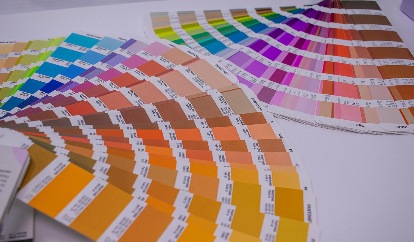
🔗 Related: Best Color Palette Generators for Designers
How to Extract Colors Using SeekColor
1. Upload Your Image
The first step in extracting colors using SeekColor is to upload your image. SeekColor supports a wide range of image formats, including PNG, JPG, and BMP, making it accessible for all users.
- Visit the SeekColor website.
- Click on the “Upload Image” button.
- Select the image you want to analyze.
After uploading, the image will appear on the screen, ready for color extraction.
2. Pick a Color from the Image
SeekColor provides a user-friendly interface that makes selecting colors effortless.
- Hover over the image to see real-time color previews.
- Click on any part of the image to capture the exact color.
- The selected color appears instantly, displaying its HEX, RGB, HSL, and CMYK codes.
This feature is incredibly useful for designers who need to extract brand colors from logos, product images, or website screenshots.
3. Get Accurate Color Codes
Once you’ve selected a color, SeekColor provides multiple color formats, including:
- HEX Code (e.g., #FF5733) – Commonly used in web design and digital graphics.
- RGB Code (e.g., 255, 87, 51) – Essential for screen-based applications.
- CMYK Code (e.g., 0%, 66%, 80%, 0%) – Used for print media.
- HSL Code (e.g., 9°, 100%, 60%) – Useful for adjusting lightness and saturation in designs.
Simply copy and paste the color code into your design software, such as Photoshop, Illustrator, Figma, or Canva.
4. Generate a Complete Color Palette
SeekColor goes beyond single-color extraction by generating an entire palette of colors from your image. This includes:
- Complementary Colors – Colors that work well together for balanced design.
- Analogous Colors – Colors that create a harmonious effect.
- Triadic Colors – Three colors that are evenly spaced on the color wheel.
This feature is perfect for designers looking to develop cohesive branding elements, website themes, or marketing materials.
🔗 Related: How to Choose the Perfect Color Scheme for Your Website
Why Use SeekColor?
SeekColor offers a range of advantages that make it the go-to tool for color extraction:
✅ Fast & Easy to Use – Extract colors in seconds with a simple click.
✅ Multiple Color Formats – Supports HEX, RGB, CMYK, HSL, and more.
✅ No Software Installation Required – 100% free and browser-based.
✅ Perfect for Designers & Developers – Helps maintain brand and design consistency.
✅ Accurate & Reliable – Provides precise color values for digital and print projects.
Who Can Benefit from SeekColor?
- Graphic Designers – Extract colors for branding, marketing, and UI/UX design.
- Web Developers – Ensure color consistency across web pages.
- Photographers – Identify dominant colors in images for better editing.
- Content Creators – Maintain a consistent aesthetic across social media platforms.
📌 External Resource: Learn more about color theory and how different colors affect branding on Adobe Color.
Tips for Choosing the Right Colors for Your Project
If you’re unsure which colors to use, here are some essential color selection tips:
1. Understand Color Psychology
Different colors evoke different emotions. For example:
- Blue – Trust and professionalism (great for corporate brands).
- Red – Passion and urgency (often used in sales and promotions).
- Green – Growth and health (ideal for eco-friendly brands).
2. Use High-Contrast Colors for Readability
High contrast between text and background improves readability, making content more accessible.
3. Stick to a Limited Color Palette
Using too many colors can make designs feel chaotic. Stick to a primary, secondary, and accent color for a cohesive look.