
Color harmony is the foundation of great design, influencing emotions, readability, and brand identity. Whether you’re a graphic designer, web developer, or artist, SeekColor helps you create well-balanced palettes that enhance aesthetics. Understanding how colors interact can make your designs more visually appealing and effective. In this guide, we’ll explore color harmony principles, different palette types, and practical applications.
🔗 For a deeper dive into color theory, visit The Interaction of Color by Josef Albers.
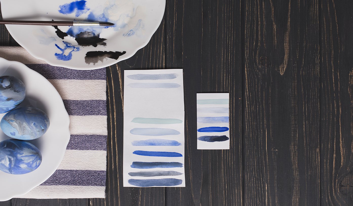
What is Color Harmony in SeekColor?
Color harmony is the art of combining colors in a visually pleasing way. It follows color theory principles to ensure balance and unity. With SeekColor’s Color Harmony Tool, designers can easily find the perfect color combinations for their projects, avoiding clashing colors and achieving a seamless look.
Why Does Color Harmony Matter in Design?
- Boosts Aesthetic Appeal: A harmonious palette enhances design quality.
- Improves Readability: The right color contrast makes content easier to read.
- Influences Emotions: Colors evoke different feelings and psychological responses.
- Strengthens Brand Identity: Consistent colors make brands more recognizable.
Types of Color Harmony in SeekColor
1. Monochromatic Harmony with SeekColor
A monochromatic palette consists of different shades and tints of the same color, creating a clean and sophisticated look.
Best Used For:
✔ Luxury branding
✔ Minimalist web design
✔ Elegant photography
🔗 Explore Monochromatic Color Palettes on SeekColor
🔗 Learn more about monochromatic colors from Adobe Color
2. Complementary Color Harmony in SeekColor
Complementary colors are opposite each other on the color wheel, such as blue and orange or red and green. These pairs create a strong contrast.
Best Used For:
✔ Sports branding
✔ Eye-catching ads
✔ High-contrast UI/UX
🔗 Find Complementary Color Schemes on SeekColor
🔗 Check out the color wheel on Canva’s Color Tool
3. Analogous Color Harmony with SeekColor
Analogous colors sit next to each other on the color wheel, providing a smooth and natural feel.
Best Used For:
✔ Nature-inspired themes
✔ Soft, calming designs
✔ Organic branding
🔗 Browse Analogous Color Palettes on SeekColor
🔗 Read more about analogous colors on Smashing Magazine
4. Triadic Color Harmony in SeekColor
A triadic scheme uses three colors evenly spaced on the color wheel, such as red, yellow, and blue. This combination adds vibrancy while maintaining balance.
Best Used For:
✔ Playful and energetic branding
✔ Comic book art
✔ Bold, artistic visuals
🔗 Check out Triadic Color Palettes on SeekColor
🔗 Discover triadic color combinations on Color Hunt
5. Tetradic (Double Complementary) Harmony in SeekColor
This scheme uses two complementary pairs, offering a rich and dynamic look when balanced correctly.
Best Used For:
✔ Advanced graphic design
✔ Fashion and textile creation
✔ Eye-catching posters
🔗 Discover Tetradic Color Schemes on SeekColor
🔗 Learn about advanced color schemes at Pantone
How to Choose the Right Color Palette in SeekColor
When selecting a palette, consider:
✔ Brand Identity: Does it match your brand’s personality?
✔ Target Audience: Different colors appeal to different people.
✔ Industry Trends: Stay updated with modern color trends.
✔ Accessibility: Ensure readability for all, including color-blind users.
🔗 Learn more about Color Psychology on SeekColor
🔗 Check accessibility with WebAIM Contrast Checker
Best Tools for Color Harmony in SeekColor
- Color Palettes | Seek Colors – Instantly create stunning color palettes.
- SeekColor Color Wheel – Explore color harmony combinations.
- SeekColor Contrast Checker – Ensure accessibility and readability.
- Adobe Color – Generate and explore trending color schemes.
- Coolors – Quickly generate and customize palettes.