
The 1980s were all about bold and vibrant neon colors, creating a visually striking era in fashion, design, and pop culture. Today, these colors are making a comeback, with many designers and creatives using SeekColor to find the perfect neon palette for their projects. Whether you’re working on fashion, graphic design, interior decor, or digital art, understanding how to use neon colors effectively can help you achieve a retro-futuristic look while maintaining visual harmony.
In this guide, we’ll explore why neon colors are trending again, how to pair them correctly, and how SeekColor can assist you in choosing the right shades to enhance your designs.
1. The Comeback of 80s-Inspired Neon Colors
Why Are Neon Colors Trending Again?
The retro aesthetic revival has influenced industries like fashion, gaming, web design, and marketing, bringing back bold neon color palettes. Brands and designers use neon to grab attention, create nostalgia, and stand out in a competitive visual space.
SeekColor makes it easy to explore neon color options that work best for your specific project, ensuring you find the right shades that reflect the 80s aesthetic while staying modern and stylish.
Where Are Neon Colors Used Today?
- Fashion & Streetwear: Neon sneakers, jackets, and accessories dominate high-fashion runways. (See latest neon fashion trends: Vogue).
- Graphic & Web Design: Many brands use SeekColor tools to generate eye-catching neon palettes for marketing materials and websites. (Get inspired by Dribbble).
- Interior Decor: Neon lighting, furniture, and accent walls add futuristic and retro vibes to modern spaces. (Learn about neon decor from Architectural Digest).
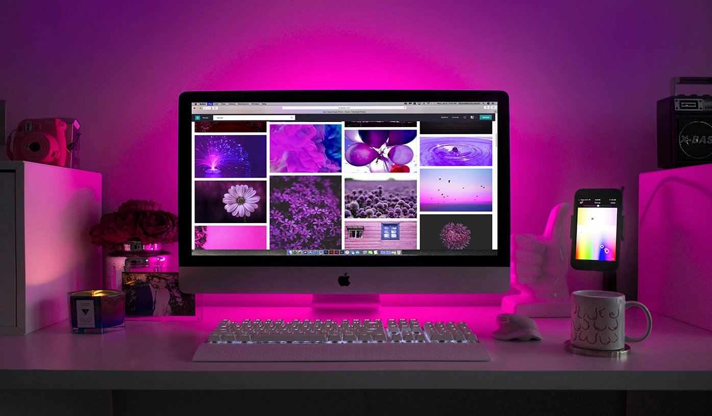
- Gaming & UI Design: Cyberpunk-inspired designs rely heavily on neon blue, purple, and pink for a high-tech visual impact. (See UI design trends on Behance).
2. Best Neon Color Combinations for an 80s Look
Choosing the right neon color palette is essential for a visually appealing design. With SeekColor, you can easily find combinations that complement your creative vision.
Classic 80s Neon Pairings:
🟢 Neon Green & Purple – Popular in arcade aesthetics and retro gaming visuals.
🔵 Electric Blue & Hot Pink – A bold duo perfect for vaporwave and synth-wave designs. (Explore Synthwave aesthetics: Reddit r/Synthwave).
🟡 Neon Yellow & Magenta – High-contrast pairing for vibrant branding and posters.
Modern Neon Color Twists:
🟠 Neon Orange & Teal – A sleek, trendy look for branding and digital art.
🔴 Neon Red & Cyan – Perfect for high-impact marketing and advertisements.
⚫ Black with Neon Accents – A stylish cyberpunk contrast used in gaming and UI design. (See Cyberpunk inspirations: Cyberpunk.net).
💡 Use SeekColor’s palette generator to find and adjust neon shades that suit your needs. (Try it out here: SeekColor).
3. How to Use Neon Colors in Design Without Overpowering
Neon colors can be powerful and energetic but using them effectively requires balance and contrast.
A. Graphic & Web Design
✅ Use SeekColor tools to select neon colors that work well on both dark and light backgrounds.
✅ Combine neon with neutral tones like black, gray, or white to avoid overwhelming designs. (More on contrast: Canva’s Design School).
✅ Gradient effects and glows make neon colors more visually appealing in digital art.
B. Interior & Home Decor
✅ Add neon LED signs to walls for a subtle yet trendy retro look. (Check out Neon Creations).
✅ Pair neon furniture or accent pieces with a monochrome background to maintain balance.
✅ Use SeekColor to explore how neon tones interact with different lighting settings.
C. Fashion & Accessories
✅ Incorporate neon into statement pieces like sneakers, sunglasses, or jackets. (Latest neon sneakers at Nike).
✅ Mix neon with neutral outfits to create a stylish yet wearable look.
✅ Use SeekColor’s fashion palette suggestions to match neon shades effortlessly.
🔗 Explore more neon color inspirations with SeekColor! [Link]
4. Common Mistakes When Using Neon Colors
🚫 Too Much Neon: Using too many neon colors at once can be visually chaotic. Stick to 1-2 key neon shades.
🚫 Poor Contrast: Avoid neon text on bright backgrounds—opt for high-contrast combinations. (More on color readability: WebAIM Contrast Checker).
🚫 Ignoring Readability: Some neon colors can be hard to read; use SeekColor to test accessibility-friendly contrasts.
🚫 Not Considering the Right Color Context: SeekColor can help you determine which neon shades match best in different environments.
📌 Need help choosing the perfect neon shades? Use SeekColor for expert color recommendations!