
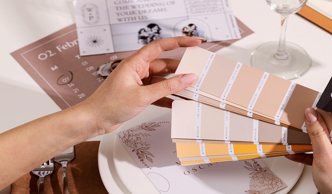
Seekcolor is your ultimate tool for discovering the perfect wedding color palette! Choosing the right color scheme is a crucial step in wedding planning, as colors define the mood, style, and overall experience of the event. Whether it’s a soft pastel spring wedding or a dramatic black-and-gold winter celebration, the right wedding color palette brings everything together beautifully.
For event planners, understanding color psychology and seasonal trends is essential in crafting a well-coordinated wedding theme. With Seekcolor, planners can easily explore, visualize, and select stunning color combinations to match their clients’ dream weddings. This guide will walk you through the importance of wedding colors, the latest color trends, and expert tips for choosing the ideal palette.
Why Wedding Color Palettes Matter
A carefully chosen wedding color scheme influences every detail of the wedding, from invitations to décor. Here’s why color selection is so important:
- Invitations & Stationery – First impressions matter! (See invitation ideas on The Knot)
- Bridesmaid Dresses & Groomsmen Attire – Well-coordinated outfits enhance the overall wedding aesthetic. (Explore dress colors at David’s Bridal)
- Floral Arrangements – Complementary flower colors create a cohesive look. (Check floral trends on Florists’ Review)
- Venue Décor & Lighting – Table settings, drapery, and lighting play a key role in color harmony. (Discover lighting inspiration on WeddingWire)
- Wedding Cake & Tableware – A stunning cake that matches the theme is a must! (See wedding cake inspiration on Martha Stewart Weddings)
The Psychology of Wedding Colors
Each color creates a different mood, making it important to choose wisely:
- White – Purity, elegance, simplicity
- Blush Pink – Romance, charm, tenderness
- Navy Blue – Sophistication, timeless appeal
- Gold – Luxury, grandeur, celebration
- Green – Freshness, nature, harmony
- Burgundy – Passion, richness, drama
With Seekcolor, planners can experiment with different shades to find the perfect color balance.
Trending Wedding Color Palettes for 2025
1. Romantic Blush & Gold
Blush pink and gold create a soft, romantic wedding atmosphere. Perfect for spring and summer weddings, this combination pairs beautifully with white flowers and greenery.
2. Classic Navy & Champagne
A sophisticated and elegant palette ideal for formal evening weddings. Adding metallic accents enhances the luxurious feel.
3. Earthy Terracotta & Sage Green
Bohemian and rustic weddings shine with warm earthy tones. Terracotta and sage green are perfect for fall weddings, paired with wooden décor and dried flowers.
4. Bold Emerald & Black
For modern and luxurious weddings, emerald, green, and black create a dramatic contrast. Gold or silver accents can elevate the look.
5. Pastel Lavender & Dusty Blue
Soft pastels bring a fairy-tale feel to spring weddings. Lavender and dusty blue work beautifully with whimsical floral arrangements.
How to Choose the Best Wedding Color Palette with Seekcolor
1. Understand the Couple’s Vision
Each couple has a unique wedding style. Ask about their theme, season, and preferences before finalizing colors.
2. Consider the Season
Certain colors work best in specific seasons:
- Spring & Summer: Light pastels, blush, peach, lavender, and sky blue.
- Fall: Warm hues like terracotta, mustard, rust, and deep reds.
- Winter: Jewel tones such as emerald, sapphire, and burgundy.
(Read more about seasonal wedding colors on Brides)
3. Use Seekcolor for Color Matching
With Seekcolor, event planners can visualize, compare, and test color combinations to ensure harmony.
4. Balance Bold and Neutral Shades
Too many bold colors can be overwhelming. Pair vibrant shades with neutral tones for an elegant look.
5. Match the Venue & Lighting
Lighting and venue settings impact color perception. Outdoor weddings work best with natural and soft tones, while indoor venues allow for bold and dramatic hues.
Wedding Color Mistakes to Avoid
1. Choosing Too Many Colors
Stick to 3-4 core colors for a cohesive design.
2. Ignoring Seasonal Trends
Selecting colors that don’t match the season may affect the overall aesthetic.
3. Overlooking Contrast & Texture
Mixing different textures (matte, glossy, metallic) adds depth to the color scheme.