The Sierra Mist colors are Eucalyptus, Mantis, golden yellow, white, we recommend using the Sierra Mist color palette for personal projects and in the case of commercial use to visit the company website. The color codes: RGB, CYMK for print, and Hex for web HTML/CSS.
Download the Sierra Mist color scheme palette image with the color hex codes as a single image. These are the suggested colors to be used for digital media.
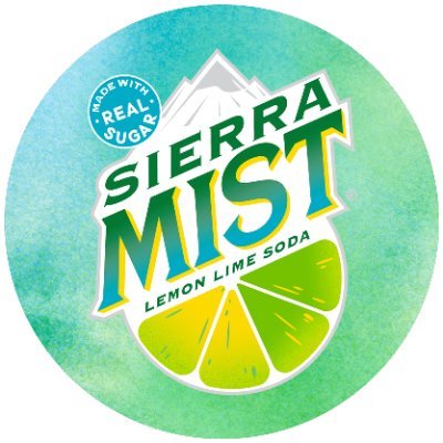
In the realm of refreshment, Sierra Mist stands as a beloved citrus-flavored soda, captivating consumers with its vibrant colors, invigorating taste, and a touch of nostalgic charm. At the heart of its brand identity lies a carefully curated color palette that has shaped its presence and resonated with generations of consumers. Let's delve into the world of Sierra Mist Colors and uncover the strategic significance behind each hue.
The combination of vibrant green and refreshing yellow forms the cornerstone of Sierra Mist's color palette. Green, a symbol of nature, freshness, and growth, aligns perfectly with Sierra Mist's citrusy essence, evoking a sense of invigorating refreshment. Yellow, on the other hand, radiates warmth, energy, and a touch of sunshine, mirroring the bright, cheerful taste of Sierra Mist.
Together, green and yellow create a harmonious visual symphony that embodies Sierra Mist's core values. The vibrant contrast between the two colors grabs attention, while their overall balance evokes a sense of refreshment and citrusy delight. Whether encountering Sierra Mist on a grocery store shelf, browsing through a menu, or enjoying a refreshing glass of soda, consumers are consistently reminded of Sierra Mist's promise of invigorating taste and a touch of nostalgia.
Complementing the vibrant green and yellow hues is a backdrop of cool white. This neutral shade provides a sense of simplicity, cleanliness, and a touch of elegance, allowing the bold citrus colors to shine through. White also represents purity, freshness, and a sense of calm, further reinforcing Sierra Mist's promise of refreshing enjoyment.
The use of white is evident across Sierra Mist's branding, particularly in its packaging designs, marketing materials, and retail displays. It creates a sense of openness, clarity, and a focus on the refreshing essence of the beverage. White sets the stage for the vibrant green and yellow colors to pop, ensuring that Sierra Mist's brand identity remains the focal point.
Sierra Mist's color palette is not just a visual aesthetic; it's a strategic tool that resonates with consumers worldwide. The combination of vibrant green, refreshing yellow, and cool white evokes feelings of refreshment, citrusy delight, and a touch of nostalgia, aligning perfectly with Sierra Mist's core values. This synergy between color and brand messaging has been instrumental in shaping Sierra Mist's reputation as a beloved citrus-flavored soda, inspiring generations of consumers to savor its refreshing taste and embrace the joy of sharing moments with friends and family.
Sierra Mist's color palette is evident across all aspects of its brand presence, from its iconic green and yellow logo and packaging designs to its marketing materials and retail displays. The consistent use of these colors reinforces the brand's identity and creates a cohesive visual experience for consumers. Whether encountering Sierra Mist in a grocery store, browsing through a menu, or enjoying a refreshing glass of soda, consumers are consistently reminded of Sierra Mist's promise of refreshment, citrusy goodness, and a touch of nostalgia.
Sierra Mist's color palette serves as a powerful example of the transformative power of color in branding. By carefully selecting and applying colors that align with its core values, Sierra Mist has established a strong and recognizable brand identity that resonates with millions of consumers worldwide. The company's color palette is not just a visual aesthetic; it's an integral part of its brand DNA, shaping its communication, consumer experience, and overall brand perception. In a world of competing beverages, Sierra Mist's color palette stands out as a beacon of refreshment, citrus delight, and nostalgic charm, inviting consumers to embrace the joy of sharing refreshing moments with loved ones.